-
Geometric Abstraction originated in early 20th-century Europe and by the 1930s it's impact on new art making went global as artists sought an alternative to depicting literal content in a world marked by economic and political crises. Characterized by the use of geometric shapes, lines, and colors to create harmony and order artists also took inspiration from indigenous art traditions and folk art to make works that transcend representational boundaries. Geometry serves as the guiding path for interpreting these works, with their evident structures forming visual building blocks that resonate and interact. Throughout the 20th and 21st centuries, geometric structures and abstract visual vocabularies have been timeless methods of conveying meaning and gaining visual literacy. Triangles, squares, and circles are elemental and universal principles in all visual arts, originating from prehistoric signs and forming the foundation of a shared visual language indicative of our common origins.
As cultures converge in contemporary times, the necessity to find common ground among diverse audiences becomes increasingly urgent. This exhibition showcases the works of artists spanning from the 1930s to the present, all relying on the rules of geometry to inform their artistic practices. Geometric Abstraction has evolved over time, embracing new technologies and influences while preserving its core principles of order, harmony, and abstraction. Its timeless and captivating appeal has made it a fundamental aspect of modern art history. Through this exhibition, we celebrate the movement's rich legacy and invite contemplation of its future potential within the ever-changing and expanding universe of art.
-
We introduce the exhibition with works unified in sensibility and approach—late lithographs by Terry Haass and Bob Blackburn, who became lifelong friends in New York. These are juxtaposed with a recent lithograph by contemporary artist Odili Odita and an etching by Mavis Pusey, who was also a colleague to Blackburn. We love that they are on one level so similar and then on other levels are highly distinctive. Blackburn’s title is instructive—Native Tongue speaks to each artist's unique language and voice.
-
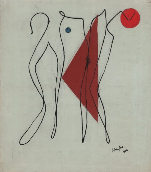
Three works by Anton Prinner, Stanley William Hayter, and Dorothy Dehner exemplify the incorporation of freestyle, spontaneity, and chance within the framework of geometry. In Hayter's Untitled (1930), he dipped a string in wet ink and carefully placed it on the paper, resulting in a sinuous black line that suggests figuration and movement, set off by a hard-edged triangle and an ember-red circle. Dehner adopts a wet-on-wet approach with her ink and watercolor from 1951, allowing certain areas of the structure to bleed into the paper, humbling the power and force of geometric shapes and introducing softness to the edges, thereby creating an atmospheric and less intense composition.
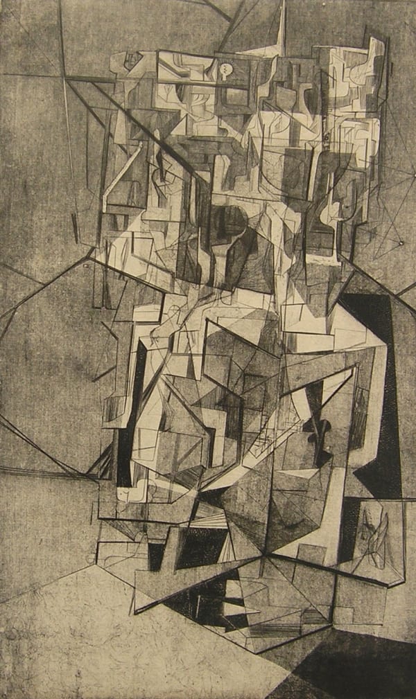
In Anton Prinner's 1936 work, Problem Spiral I, the artist visualizes movement through a technique called "papyrogravure." Cardboard shapes are cut and glued onto a sheet of paper, which is then covered with varnish. Additional elements, such as string roundels, are placed on the matrix and removed after inking, leaving a white silhouette on the printed sheet. A strong white circle rests on the plane of a triangular line, while traces of a spiral of energy recedes into deeper space. Shifts in tone add a sense of atmosphere and drama in shadowy twilight. Prinner, an early member of Constructivist Abstraction, was part of an influential art movement that emerged in the early 20th century, embodying the spirit of modernity and innovation. Born amidst the tumultuous Russian Revolution, this movement aimed to break away from traditional artistic conventions and embraced a radical approach that celebrated geometric forms, bold colors, and functional art. Rather than merely imitating nature, they sought to reflect the dynamic and industrial character of the modern world.
-
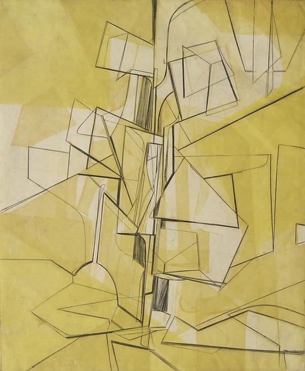
Harry Hoehn joined Terry Haass as a co-director of Atelier 17 in New York in the Spring and Summer of 1951. Hoehn's approach involves building tower-like structures that reach upward and yet remain firmly anchored in the foundations of geometry. Simultaneously, these structures appear to vanish and retreat in an illusion of deep space, refracting and reflecting light for an intriguing visual effect. Planetary Exploration from 1951 showcases Hoehn’s mastery in using stencils and various printing techniques to evoke the effects of soft, golden light. A sculptural black line defines boundaries, and sets a dashing rhythm to guide the viewer's eye throughout the composition. A superstructure composed of triangles, hexagons, and archways that extend into different planes suggesting an infinite space. Hoehn's utilization of a recently developed transfer process at Atelier 17 treats the variable field of yellow, adding to the distinctive and captivating nature of this dynamic work.
-
The metaphor of music as a representation of abstraction can be traced back to Kandinsky. Margaret Balzer's Quartet, and E. B. Adams's Opus 127 Beethoven bring the tradition to the mid-century. Atelier 17, with its origins in Surrealism, naturally progressed towards abstraction, recognizing the significant role that an artist's materials play in shaping the content of an artwork. Balzer skillfully employs a buren technique to create a tonal progression ranging from soft grey to deep black. Her abstracted musicians are given a human touch by incorporating two eyes and a mouth into their geometric-based structure, reminiscent of Picasso's Three Musicians. E. B. Adam uses a taut composition of lines and tones to interpret the sounds of classical instruments, building movements that seamlessly transition into other movements within the artwork. Jonathan Williams crafts a back-lit space reminiscent of Piranesi's masterpieces, particularly the Imaginary Prisons series. Although the title of Williams' work provides only a slight clue, the engraving is complex and satisfying, inviting viewers to interpret and explore its meaning.
-
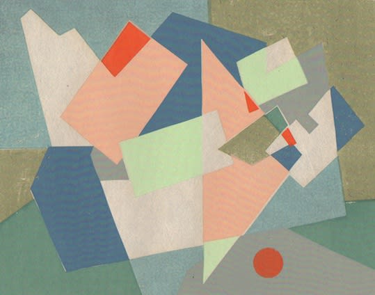
Judith Rothschild's Greenwich Village, a screenprint from 1945, along with a color woodcut by Alice Trumbull Mason and color etching by Nina Negri, show these accomplished artists layering geometric shapes against a pattern. The contrast activates space and creates up tempo rhythms allowing room for progress and evolution in their compositions.
Tom Lias’s 1947 Abstract No. 1 and No. 2 are two resolved works made from the same plate, engraved on both surfaces. With Abstract No. 1, Lias rolled the earthy red ink upon the surface, leaving white lines from the engraved plate; in Abstract No. 2, the red ink is rubbed into the engraved lines, and yellow ink is rolled onto the surface via stencil. A unique proof impression shows the artist taking his experiment further and reversing the order in which the inks are applied. Shapes bounce with rhythmic movement, akin to a harmonious Bee Bop ensemble, with each element taking turns playing the melody.
-
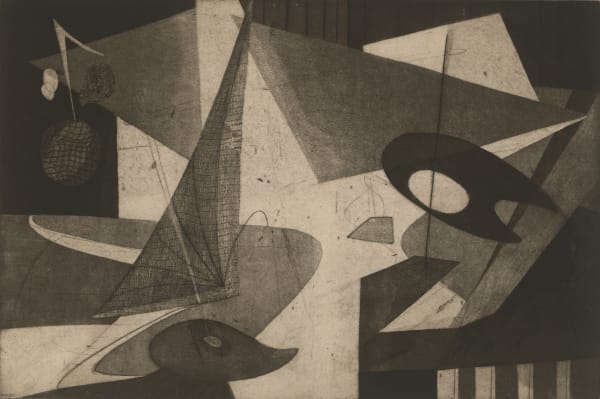
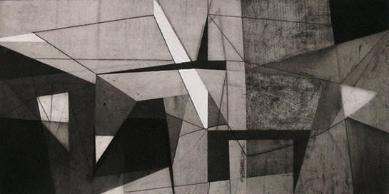
Dynamic compositions by Jean Morrison, Tom Lias, John Paul Jones, and Morris Blackburn arrive at highly unique results from the shared approach of breaking and contorting grids to carve out space. Each artist skillfully manipulates and challenges the traditional grid, and compositions transform into a labyrinth of abstract dimensions. A single line defines multiple planes, creating a maze-like arrangement of space. While squares and rectangles serve as building blocks, truncated to triangles, they pierce through space, adding further dimensions, and expanding the boundaries of artistic exploration.
-
Abstracting observed landscape and still life was an ongoing concern for Morris Blackburn from the late 1930s to works made in the 1970s. Heavy black lines and bright, flat rectangular and triangular shapes impose a rigid structure upon a conventional landscape in Gloucester Harbor, a painting on paper made in 1946. In 1950, he transformed the composition by editing out the harbor details to a reductive, color-driven abstraction, the screen print Cloud Planes. Blackburn was among the first artists to adapt screen printing to his fine art practice. Twenty years on, Blackburn painted Andy’s, a large oil on canvas showing that he continued to see fresh possibilities for defining a landscape space through geometry and abstraction.
-
During the early 1960s, Sam Gilliam was closely associated with the Washington Color School, a collective of Color Field painters centered in Washington, DC. This group was characterized by their preference for flat, geometric, and minimalist compositions, allowing them to emphasize color and its relationships as the primary focal point of their artistic expression. Gilliam's prior explorations into geometric abstraction provided a solid foundation for creating his monoprint, Aviation VI (1990). In this compelling composition, he revisits his fascination with hard-edged geometric shapes. By skillfully arranging these shapes and incorporating a scale contrast between the red and blue triangles, he establishes a sense of spatial depth and dynamic movement within the artwork. Through the clever use of fine lines, layered patterning, expressive mark-making, and adept applications of ink, the composition exudes a remarkable sense of energy and vibrancy. In this artwork, Gilliam appears to break new ground, constantly challenging himself to venture into uncharted territories within his artistic practice—a testament to his ceaseless spirit of exploration and innovation.
-
Harvey Quaytman's dedication to Geometric Abstraction has been instrumental in pushing the genre forward and establishing its relevance in contemporary art. His paintings are a testament to the marriage of intellectual depth and aesthetic elegance. Quaytman elevated abstract painting beyond the ordinary, inviting viewers into the realm of cognitive comprehension through a heightened sensory experience with materials and a profound clarity of space. His art possesses a cerebral quality that engages the mind, yet it also exudes a captivating sensuality, drawing viewers into a world of artistic exploration and contemplation. Quaytman's relentless pursuit of innovation and his ability to imbue his works with both intellectual rigor and emotional appeal has secured his position as a key figure in the evolution and enduring significance of Geometric Abstraction. As a result of his contributions and artistic vision, Geometric Abstraction remains a vibrant and enduring genre in contemporary art, inspiring artists and audiences alike to engage with its complexities and appreciate the profound beauty that can be found in its precise and elegant forms.
-
Steve Ford's artistic approach centers on a paradox: the formality of a grid played against a bold sense of liberation. Precise and thoughtful execution guides his practice, and form evolves from the inception of each work. Applying stencils and printing upon folded papers, Ford generates layers of pattern that remain visible through transparent inks. Works included here come at circle-as-theme from opposing directions. Veils of bright color activate the surface of Untitled (U0725F), which plays a field of soft circles against precariously stacked squares and rectangles. With Untitled (U0223C), a concentric circular pattern reverberates throughout, creating a sense of depth and ambiance. The surface shimmers, reminiscent of how light shifts and reflects upon a body of water. Shapes tumble and dance within atmospheric energy. From this interplay of precise geometric elements against fluid color, Ford pushes the boundaries of the grid and injects movement and life into his work.
-
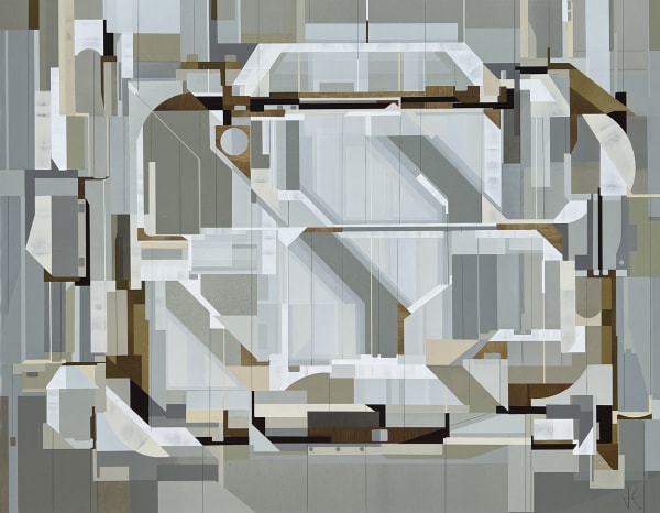
Kennedy's artistic creations form a bustling invented metropolis of shapes and lines. His mixed media paintings and collagraph prints delve into the exploration of space, structures, and connections. With an understated and handsome palette of soft, pale colors and carefully modulated grays, Kennedy skillfully maps out space and employs repetition to construct new dimensional forms. His deep knowledge of modern art, dance, and architectural design converge within his works, inspiring a unique artistic vision. Free from the constraints of three-dimensional space, Kennedy likens his creations to landscapes or "sites," where ideas and negotiations come to life through layers of shallow reliefs. Concepts and interactions within a visually multi-dimensional realm offer a deeply satisfying seeing experience.
-
Christopher Hartshorne possesses a keen sense of design, combined with brilliant intuition and a deep connection to color and its emotional impact. This work suggests movement and utilizes color theory to create a captivating visual experience. The use of an ever-present geometry and layering patterns reveal the nature of the medium-carved woodblocks.
-
Michel-Thomas Tremblay's highly skilled approach involves arranging columns of pattern that shimmer against a dark background, conjuring an illusion of an imagined city skyline. The patterns consist of simplified rectangles adorned with dots and grids. The resulting composition emanates a radiant glow akin to a beacon of endless possibilities. Tremblay chose deep blue ink, yet his work evokes the experience of the Emerald City, as depicted in The Wizard of Oz. The city embodies an idealized and enchanting vision of urban life, contrasting sharply with the gritty street views famously depicted by the Ashcan School.
Matsutani's work takes us on an invented, almost surreal scene of masterfully etched and engraved forms, creating a unique design that suggests machine parts that float in space. For L'Angel, he cut out a rectangle from the copper plate, inking it with green for a nearly seamless, collaged effect on the flat surface. Recipient of a scholarship to study in Paris in 1966, Matsutani decided to permanently settle there, finding a welcoming community and working atmosphere at Stanley William Hayter's Atelier 17, where he found a medium and method for his perfectly executed organic and mechanical forms. Matsutani served as Hayter's assistant while exercising his formidable skills as an engraver at Atelier 17 throughout the late 1960s and 1970s. The workshop served as the launch pad for the dynamic studio practice that has earned Matsutani the highest international regard.
-
Shu Lin Chen was born in Taiwan in 1967 and lives and works in Paris. A-Pesanteur or ‘weightlessness’ is the apt title for her masterful engraving. Shu Lin employs simultaneous color printing to create an atmosphere of floating circles set against a layered, soft green and yellow ground. Crisp lines suggest a tethering of the circles but, they remain free, an invented constellation of form in invented space.
-
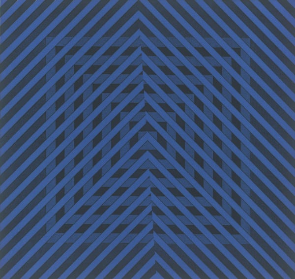
During the 1960s and 70s, Op Art and mathematics served as a driving force for many abstract artists. Stanley William Hayter immersed himself in the observation and understanding of the visual properties of water. He enjoyed fishing and swimming in the rivers of the Ardèche, increasingly fascinated by the infinite variety of ripples, eddies, and ways light reflected the flowing and shifting surface. Water is the over-arching theme, as seen in works like Untitled from 1964 and Wake from 1968, where Hayter explores geometry to speak to what he found in nature. Hayter's extensive knowledge of scientific theory, particularly regarding waves and wavelengths, suggests scientific or scientific methods as explanations of color and sound perception. With the language of wave theory incorporated into art practice, these artists connect us to ancient traditions while infusing some works with a futuristic quality. The reductive visual vocabulary they employ holds the potential to transcend time, with variations and repetitions reminiscent of a genetic code. This amalgamation of art, science, and nature forms a compelling intersection where artistic expression intertwines with the mysteries of the natural world, inviting contemplation of both the ancient past and the uncharted future.
-
The works of Terry Haass, Nona Hershey, Jean Morrison, Amze Emmons, and Nono Reihold play with a balance between abstraction and representation. Their works share an ability to transform places and experiences seen in the world into works informed by their understanding of geometry and reliant upon viewers' ability to read visual cues from our shared knowledge of geometry.
Terry Haass' screenprint Untitled, 1993 exploits the power of simplicity, effectively creating a third element from the juxtaposition of only two. Untitled, 1993, raises questions—does it imply the opening of a door, allowing a shard of light to enter, or is it merely an example of minimal and elegant design? Perhaps both. Known for her diverse artistic journey, Terry Haass did not fully embrace hard-edged geometric abstraction until the 1980s and 90s. Her earlier works were rooted in organic, geological, and figurative abstraction. In these late works, one can appreciate the clarity of design and her confident execution in this highly reductive work.
Nona Hershey utilizes the principles of perspective, an early method of applying geometry to suggest a 3D space on a 2D surface. Telone and Awning give the sensation of looking up at a wall with a window, while sharp, mid-day light compresses the shadows into distinct bands of darkness, creating a compelling illusion of real architectural space.
In Jean Morrison’s Untitled etching from the 1940s, the interplay of contrasting shapes of shadow and light blurs the line between interior space and puzzle-like abstraction. Dominated by three white-of-the-paper shapes set against a deep black tone, the composition evokes the feeling of a stage set illuminated from behind, with the light cutting through open windows and door-like white forms. The artwork demonstrates masterful execution with great economy.
-
Nono Reinhold’s abstract composition portrays a building facade, simplifying the geometric structure of a plum-colored facade. The definitive pattern of lintel, windows, and points adds to its visual appeal. It is both a common and unique vision and emphasizes the importance and pleasure of seeing. Reinhold identifies patterns and shapes, then tranforms a common view into art.
Amze Emmons employs the pattern of wall-to-ceiling windows within an airport waiting gate to construct a believable space. Fine scratches and detritus left on the printing plate create reflections on the glass and simulate wear and tear on the chairs and flooring, enhancing the realism of the scene.
-
Mary Lee Bendolph, a revered quilt maker from the remote and storied Gee's Bend, Mississippi collective, cuts and assembles geometric shapes of fabric, usually scraps of family clothing, which she then transforms into lively geometric compositions. They are astonishingly sophisticated and seem informed by a comprehensive understanding of Modernist art. However, her quilts remain unmistakably entirely her inventions. The tradition of quilt-making runs deep in Bendolph’s family, and her mother played a pivotal role in establishing the Freedom Quilting Bee, a cooperative enterprise established during the 1960s. In Gee's Bend, quilt-making was a natural and integral activity done to support families between planting and harvesting seasons. Hope, a quilt created in 2010, was made by Bendolph to become a color etching by an ingenious method of acid-etching the design and textures onto a copper plate. The technique is soft ground etching, and the quilt was placed upon the copper plate coated with a soft, beeswax-like substance to take the impression of the quilt, capturing the fabric textures and seams. Additional plates were expertly fashioned to produce each color. These plates were masterfully inked and printed, giving us the rich colors and tonalities that make Mary Lee’s quilts special. This process is a testament to the previously unknown harmonious synergy between quilt makers and printmakers.
-
David Shapiro's artistic journey had always intertwined his creative passion with a deep dedication to Eastern spirituality. He embraced the concept of the god structure, a structure that both is and is not—drawing inspiration from motifs derived from Buddhist hand symbols and yoga poses, which he incorporated into his artworks. He translated these motifs onto specific Japanese papers to further enhance his pieces, using patterning and a textured surface that adds a unique dimension to his art. An illustration of this can be seen in his painting Clearing 136-12-P, 2012, where Shapiro printed a circle onto a piece of red hand-colored paper paired with the outline of a larger circle on earth-toned fabric. This meticulous process allowed him to infuse his art with a sense of spirituality and a harmonious fusion of cultural influences yet relies on geometry as prehistoric signs are still part of us today.
-
Ryan Parker's Temple series completes a full circle by drawing inspiration from the real world and reimagining blueprint-like diagrams for religious structures. Parker prints these designs using woodblocks and plant-based dyes, which are then cured onto paper. Despite a limited palette, the resulting colors are earthy and sumptuous, evoking the idea that these prints represent ancient plans for worship buildings that might have endured the test of time or perhaps have been lost to history. Through this artistic process, Parker skillfully infuses his work with a sense of mystery and nostalgia, inviting viewers to reflect on the rich history and cultural significance of these imagined temples. The combination of ancient-like diagrams and the use of natural dyes creates a unique and captivating blend of contemporary art with a timeless and symbolic touch.